#30DayMapChallenge - Dimensions Map
Dimensions Theme for the #30DayMapChallenge 2025. A visually striking joy plot of typical 'Basin & Range' geology in a part of the Great Basin in Nevada, treating elevation bands as dimensions.
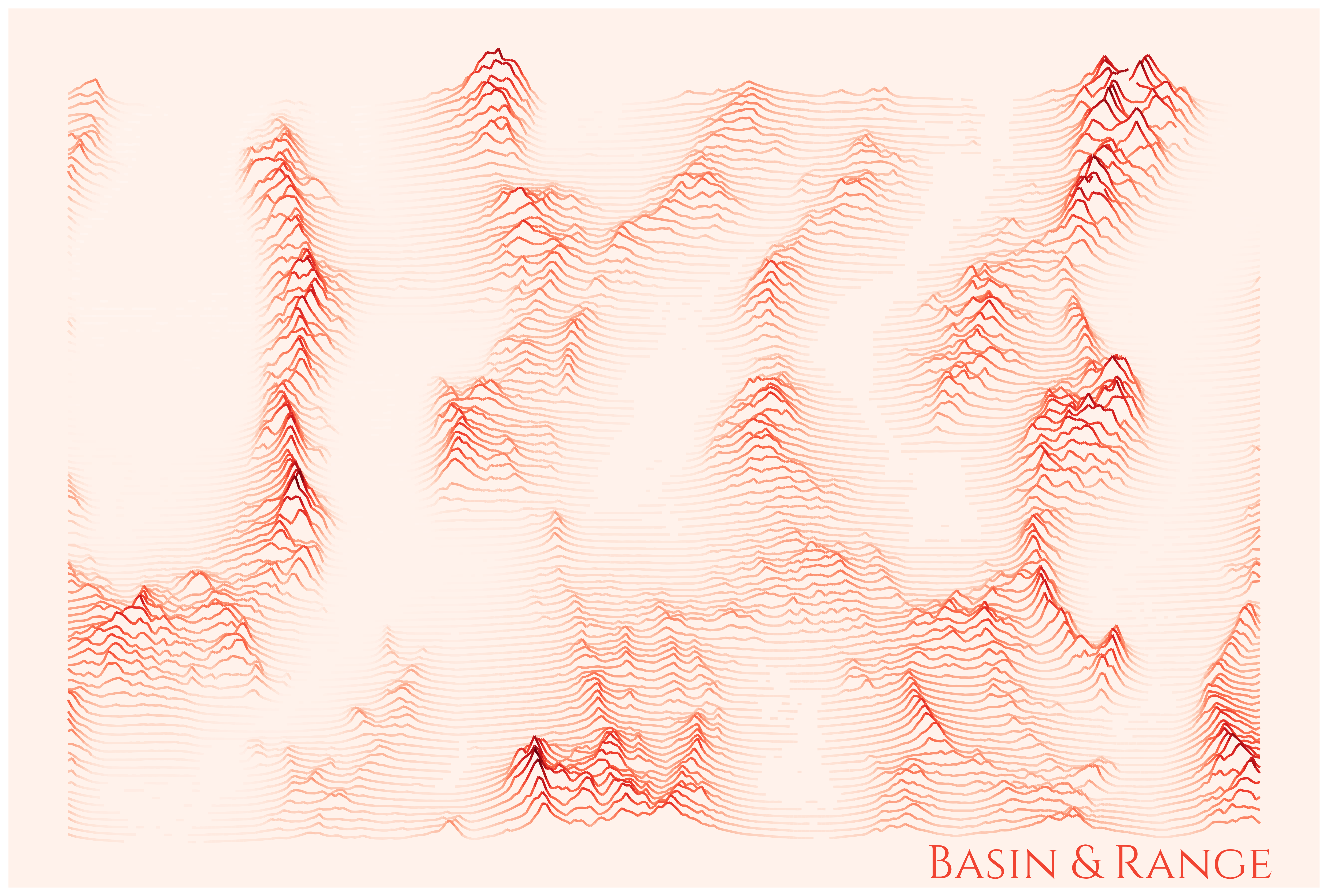
Basin & Range Joy Plot Map - Great Basin, Nevada
Basin & Range Joy Plot Map - Great Basin, Nevada
Click markers or scroll to explore
1
Sharp Visual Contrast Demonstrates Dramatic and Frequent Elevation Changes
Relatively short mountain ranges punctuated by shallow basins, frequently changing across the landscape, is characteristic of 'Basin & Range' geology. This joy plot representing elevation contours is a beautiful way to demonstrate it.
Code
Day6_clean.ipynbpython
import matplotlib.pyplot as plt
from ridge_map import RidgeMap

OUTPUT = '/Users/mauricefarber/Documents/Personal Projects/30-Day Map Challenge/Images/basin_and_range.png'

cmap        = plt.get_cmap('Reds')
darker_color = cmap(0.02)   # background: near-white pinkish
title_color  = cmap(0.6)    # label: medium red

rm = RidgeMap((-116.079783, 39.200799, -114.700999, 40.131050))
values = rm.get_elevation_data(num_lines=100)
values = rm.preprocess(
    values=values,
    lake_flatness=2,
    water_ntile=2,
    vertical_ratio=55,
)
rm.plot_map(
    values=values,
    label='Basin & Range',
    label_color=title_color,
    label_x=0.7,
    label_y=0.01,
    label_size=40,
    linewidth=2,
    kind='elevation',
    line_color=plt.get_cmap('Reds'),
    background_color=darker_color,
)

plt.savefig(OUTPUT, dpi=600, bbox_inches='tight', pad_inches=0.1)
Conclusion
This visualization is reminiscent of infamous album artwork from Joy Division. The Python Package used to create it, ridgemap, has become my new favorite way to demonstrate the dimension of elevation.